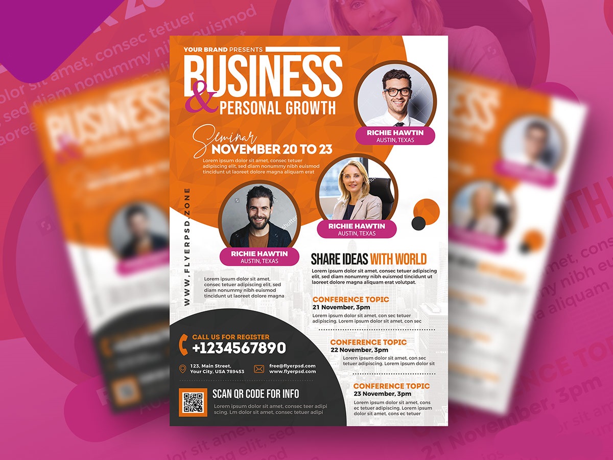
Meeting flyers can be an effective tool for promoting events and communicating important information to attendees. However, creating a flyer that is both visually appealing and informative can be a challenge. To help you create a successful meeting flyer, we have compiled a list of dos and don’ts that you should keep in mind when designing your flyer.
DO:
1. Keep it simple
Your flyer should be easy to read and understand. Stick to one or two fonts and a limited color palette to avoid overwhelming your audience. Use white space to break up text and create a clean, uncluttered design.
Do you want to create a compelling and polished flyer for your upcoming meeting to enhance its professionalism and appeal? these meeting flyer templates make it easy to design a standout flyer in minutes. With a variety of customizable options, you can tailor your flyer to your specific needs and impress your attendees.
2. Use high-quality images
Use high-resolution images that are relevant to your event. Images that are blurry or pixelated can detract from the overall quality of your flyer. If possible, use original photography or artwork to make your flyer stand out.
3. Include all necessary information
Your flyer should include all important details, such as the date, time, location, and any other relevant information. Make sure the text is easy to read and prominently displayed.
4. Make it visually appealing
Your flyer should be eye-catching and visually appealing. Use graphics, icons, and other design elements to draw attention to key points.
5. Be consistent
Use consistent branding elements throughout your flyer, such as the same font, colors, and logo. This will help create a cohesive look and feel that reinforces your brand identity.
6. Make it easy to read
Use headings and subheadings to break up text and make it easy to skim. Use bullet points or numbered lists to highlight important information.
7. Get feedback
Before finalizing your flyer, ask for feedback from others to ensure it is clear, concise, and effective.
DON’T:
1. Overload with information
Avoid cramming too much information into your flyer. Stick to the most important details and leave out any unnecessary information.
If you’re looking for inspiration for your next meeting flyer, check out these collections of stunning meeting flyer examples that are sure to grab attention. From bold designs to elegant layouts, our meeting flyer examples showcase the best in creative marketing to help you promote your event with confidence.
2. Use too many fonts or colors
Stick to one or two fonts and a limited color palette. Using too many fonts or colors can make your flyer appear cluttered and unprofessional.
3. Forget the call-to-action
Your flyer should include a clear call-to-action, such as “register now” or “visit our website.” Make sure it is prominently displayed and easy to find.
4. Neglect the layout
The layout of your flyer is important. Make sure the text is organized in a logical and easy-to-follow manner. Use headings and subheadings to break up the text and create a hierarchy of information.
5. Ignore your audience
Consider your target audience when designing your flyer. Use language and imagery that will resonate with them and make the flyer relevant to their interests.
6. Use copyrighted material without permission
Make sure you have the proper permissions to use any images or other material in your flyer. Using copyrighted material without permission can result in legal trouble.
7. Be afraid to get creative
While it’s important to keep your flyer simple and easy to read, don’t be afraid to get creative with your design. Try new layouts, graphics, and other elements to make your flyer stand out.
By following these dos and don’ts, you can create an effective meeting flyer that effectively communicates your message and engages your audience. Remember to keep it simple, use high-quality images, include all necessary information, make it visually appealing, be consistent, make it easy to read, get feedback, and include a clear call-to-action. With these tips, your meeting flyer is sure to be a success.
To wrap it up
Meeting flyers are an essential tool for promoting your event or meeting. To create effective flyers, keep your design simple, use high-quality images, include white space, be consistent, and use hierarchy. Also, get creative with your layout, consider your audience, keep your branding consistent, and include a clear call-to-action. Avoid cluttered design, low-quality images, too much text, inconsistency, lack of hierarchy, and failure to include a call-to-action. By following these dos and don’ts, you can create visually appealing and effective meeting flyers that drive attendance to your event or meeting.


